Sometimes, you might have more than one series of data to display on a single chart, or you want to compare two sets of data on the same chart. In some cases, you might want to use different charting types on the same chart. For example, you might want to include a line chart on a bar chart.
To combine multiple data series into a single chart, insert multiple cfchartseries tags within a single cfchart tag. You control how the multiple data collections are charted using the seriesPlacement attribute of the cfchart tag. Using this attribute, you can specify the following options:
default Let ColdFusion determine the best method for combining the data.
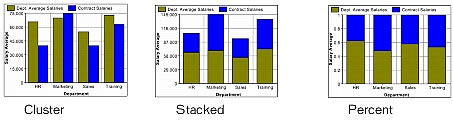
cluster Place corresponding chart elements from each series next to each other.
stacked Combine the corresponding elements of each series.
percent Show the elements of each series as a percentage of the total of all corresponding elements.
The following figure shows these options for combining two bar charts:
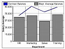
You can also combine chart types. The following is a combination bar and line chart:
The only chart type that you cannot mix with others is the pie chart. If you define one of the data series to use a pie chart, no other chart will appear.
The example in the following procedure creates the chart in the previous figure, which shows a bar chart with a line chart added to it. In this example, you chart the salary of permanent employees (bar) against contract employees (line).
Note: The layering of multiple series depends on the order that you specify the cfchartseries tags. For example, if you specify a bar chart first and a line chart second, the bar chart appears in front of the line chart in the final chart.
cfchart tag so that it appears as follows:
<cfchart
		backgroundColor="white"
		xAxisTitle="Department"
		yAxisTitle="Salary Average"
		font="Arial"
		gridlines=6
		showXGridlines="yes"
		showYGridlines="yes"
		showborder="yes"
	>
	<cfchartseries
		type="line"
		seriesColor="blue"
		paintStyle="plain"
		seriesLabel="Contract Salaries"
		>
			<cfchartdata item="HR" value=70000>
			<cfchartdata item="Marketing" value=95000>
			<cfchartdata item="Sales" value=80000>
			<cfchartdata item="Training" value=93000>
		</cfchartseries>
	<cfchartseries
		type="bar"
		query="DeptSalaries"
		valueColumn="AvgByDept"
		itemColumn="Dept_Name"
		seriesColor="gray"
		paintStyle="plain"
		seriesLabel="Dept. Average Salaries"
		/>

</cfchart>